Exhibition Graphics for the Museum of Wrecks
Client: Museum of Wrecks (Vrakmuseet, SMTM)
Team:
Exhibition Design: Expology
Graphic Identity & Type: Banker Wessel
Exhibition Graphics: Charlotte Ryberg
I worked in this extensive project as Exhibition Graphic Designer for the permanent exhibition of the new Museum of Wrecks, together with the team at Expology, who was responsible for the Exhibition Design. The foundational Exhibition Identity and the custom font was developed by Banker Wessel. I will update with more photos of this project soon.

Architectural Graphics. Intro the exhibition “Under Ytan/Beneath the Surface”. A tinted white typography on layered glass with an ocean effect.

Print guide for the Exhibition “Minnenas hav/Sea of memories”, with detailed and numbered illustrations of all objects.

Architectural Graphics. Intro the exhibition “Det delade havet/The divided sea”. Black typography and animated typography (animation by Banker Wessel), mirrored map on wood panels.
Two levels of typography, black on alu surface, illustration in black and highlighted tinted white.

Typography on an ash cabinet.

Close-up of the intro graphics dividing the spaces, here Estonia.

Integrated architectural exhibition graphics, black typography and illustration on brushed aluminium, introducing each space and wreck with name, introductory story and a map with fact sheet.


Close-up of the intro graphics dividing the spaces, here Estonia.
Quote. Black typography on alu surface.

Architectural Graphics. Intro the exhibition “Uppdraget/The Assignment”.

Ditt uppdrag/Your assignment. Map over three levels of the assignment. Blue typography on light grey walls, matching the blue theme of the space.


Detail.

Detail. Black typography on ash cabinet walls.

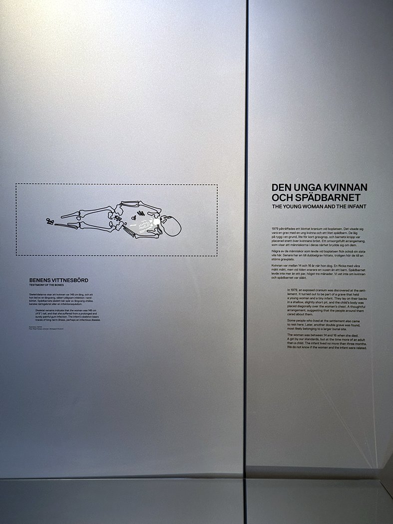
Layered illustrations and typography on glass.

Integrated architectural exhibition graphics, detail/object level, black typography and illustration on ash.
Black typography and illustrations on tinted white cabinet walls.


This exhibition has a high level of interactivity. Both analogue and digital. We supported the UX/UI team with original artwork.
Testing, testing, testing. We always strive to be able to test colours and materials on sight with testprints, material samples, colour reference for architectural prints on existing and sometimes complicated materials.

Detailed drawings with exact measurements for the applications on each section, each surface. This was of high importance on this project since all graphics was integrated on the surface i.e. printed directly on the architectural surfaces.